Making Plots With plotnine (aka ggplot)
Contents
Making Plots With plotnine (aka ggplot)
Instructor notes
Estimated teaching time: 40 min
Estimated challenge time: 50 min
Key questions:
” How can I visualize data in Python ?”
” What is ‘grammar of graphics’ ?”
Learning objectives:
“Familiarise yourself with The Grammar of Graphics through plotinine library”
“Create a ggplot object.”
“Explore different geom objects”
“Explore other layers of ggplot, including themes and labels”
Key points:
“plotnine is python implementation of The Gramma of Graphics”
“ggplot is a set of gramma rules to make publication quality plots”
“ggplot has idea of layer, building a plot is just adding different layers together”
Introduction
Python has a number of powerful plotting libraries to choose from. One of the oldest and most popular is matplotlib - it forms the foundation for many other Python plotting libraries. For this exercise we are going to use plotnine which is a Python implementation of the The Grammar of Graphics, inspired by the interface of the ggplot2 package from R. plotnine (and it’s R cousin ggplot2) is a very nice way to create publication quality plots.
The Grammar of Graphics
Statistical graphics is a mapping from data to aesthetic attributes (colour, shape, size) of geometric objects (points, lines, bars)
Faceting can be used to generate the same plot for different subsets of the dataset
These are basic building blocks according to the grammar of graphics:
data The data + a set of aesthetic mappings that describing variables mapping
geom Geometric objects, represent what you actually see on the plot: points, lines, polygons, etc.
stats Statistical transformations, summarise data in many useful ways.
scale The scales map values in the data space to values in an aesthetic space
coord A coordinate system, describes how data coordinates are mapped to the plane of the graphic.
facet A faceting specification describes how to break up the data into subsets for plotting individual set
Let’s explore these in detail.
First, install the pandas and plotnine packages to ensure they are available.
!pip install pandas plotnine
Requirement already satisfied: pandas in /home/danph/Repos/win_ssd/myprojects/python-workshop-base/.venv/lib/python3.8/site-packages (1.4.0)
Requirement already satisfied: plotnine in /home/danph/Repos/win_ssd/myprojects/python-workshop-base/.venv/lib/python3.8/site-packages (0.8.0)
Requirement already satisfied: pytz>=2020.1 in /home/danph/Repos/win_ssd/myprojects/python-workshop-base/.venv/lib/python3.8/site-packages (from pandas) (2021.3)
Requirement already satisfied: python-dateutil>=2.8.1 in /home/danph/Repos/win_ssd/myprojects/python-workshop-base/.venv/lib/python3.8/site-packages (from pandas) (2.8.2)
Requirement already satisfied: numpy>=1.18.5 in /home/danph/Repos/win_ssd/myprojects/python-workshop-base/.venv/lib/python3.8/site-packages (from pandas) (1.22.2)
Requirement already satisfied: statsmodels>=0.12.1 in /home/danph/Repos/win_ssd/myprojects/python-workshop-base/.venv/lib/python3.8/site-packages (from plotnine) (0.13.2)
Requirement already satisfied: mizani>=0.7.3 in /home/danph/Repos/win_ssd/myprojects/python-workshop-base/.venv/lib/python3.8/site-packages (from plotnine) (0.7.3)
Requirement already satisfied: scipy>=1.5.0 in /home/danph/Repos/win_ssd/myprojects/python-workshop-base/.venv/lib/python3.8/site-packages (from plotnine) (1.8.0)
Requirement already satisfied: descartes>=1.1.0 in /home/danph/Repos/win_ssd/myprojects/python-workshop-base/.venv/lib/python3.8/site-packages (from plotnine) (1.1.0)
Requirement already satisfied: matplotlib>=3.1.1 in /home/danph/Repos/win_ssd/myprojects/python-workshop-base/.venv/lib/python3.8/site-packages (from plotnine) (3.5.1)
Requirement already satisfied: patsy>=0.5.1 in /home/danph/Repos/win_ssd/myprojects/python-workshop-base/.venv/lib/python3.8/site-packages (from plotnine) (0.5.2)
Requirement already satisfied: pillow>=6.2.0 in /home/danph/Repos/win_ssd/myprojects/python-workshop-base/.venv/lib/python3.8/site-packages (from matplotlib>=3.1.1->plotnine) (9.0.1)
Requirement already satisfied: cycler>=0.10 in /home/danph/Repos/win_ssd/myprojects/python-workshop-base/.venv/lib/python3.8/site-packages (from matplotlib>=3.1.1->plotnine) (0.11.0)
Requirement already satisfied: fonttools>=4.22.0 in /home/danph/Repos/win_ssd/myprojects/python-workshop-base/.venv/lib/python3.8/site-packages (from matplotlib>=3.1.1->plotnine) (4.29.1)
Requirement already satisfied: pyparsing>=2.2.1 in /home/danph/Repos/win_ssd/myprojects/python-workshop-base/.venv/lib/python3.8/site-packages (from matplotlib>=3.1.1->plotnine) (3.0.7)
Requirement already satisfied: kiwisolver>=1.0.1 in /home/danph/Repos/win_ssd/myprojects/python-workshop-base/.venv/lib/python3.8/site-packages (from matplotlib>=3.1.1->plotnine) (1.3.2)
Requirement already satisfied: packaging>=20.0 in /home/danph/Repos/win_ssd/myprojects/python-workshop-base/.venv/lib/python3.8/site-packages (from matplotlib>=3.1.1->plotnine) (21.3)
Requirement already satisfied: palettable in /home/danph/Repos/win_ssd/myprojects/python-workshop-base/.venv/lib/python3.8/site-packages (from mizani>=0.7.3->plotnine) (3.3.0)
Requirement already satisfied: six in /home/danph/Repos/win_ssd/myprojects/python-workshop-base/.venv/lib/python3.8/site-packages (from patsy>=0.5.1->plotnine) (1.16.0)
# We run this to suppress various deprecation warnings from plotnine - keeps our notebook cleaner
import warnings
warnings.filterwarnings('ignore')
Plotting in ggplot style
Let’s set up our working environment with necessary libraries and also load our csv file into data frame called survs_df,
import numpy as np
import pandas as pd
from plotnine import *

%matplotlib inline
survs_df = pd.read_csv('surveys.csv').dropna()
To produce a plot with the ggplot class from plotnine, we must provide three things:
A data frame containing our data.
How the columns of the data frame can be translated into positions, colors, sizes, and shapes of graphical elements (“aesthetics”).
The actual graphical elements to display (“geometric objects”).
Introduction to plotting
ggplot(survs_df, aes(x='weight', y='hindfoot_length')) + geom_point()
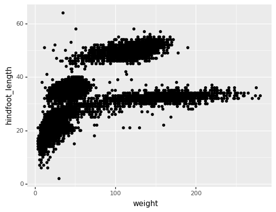
<ggplot: (8738739922101)>
Let’s see if we can also include information about species and year.
ggplot(survs_df, aes(x='weight', y='hindfoot_length',
    size = 'year')) + geom_point()
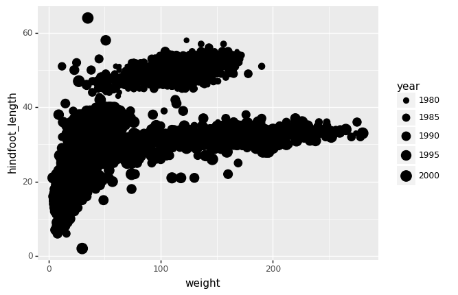
<ggplot: (8738737756962)>
Notice that we’ve dropped the x= and y= ? These are implied for the first and second argument of aes().
ggplot(survs_df, aes(x='weight', y='hindfoot_length',
    size = 'year', color = 'species_id')) + geom_point()
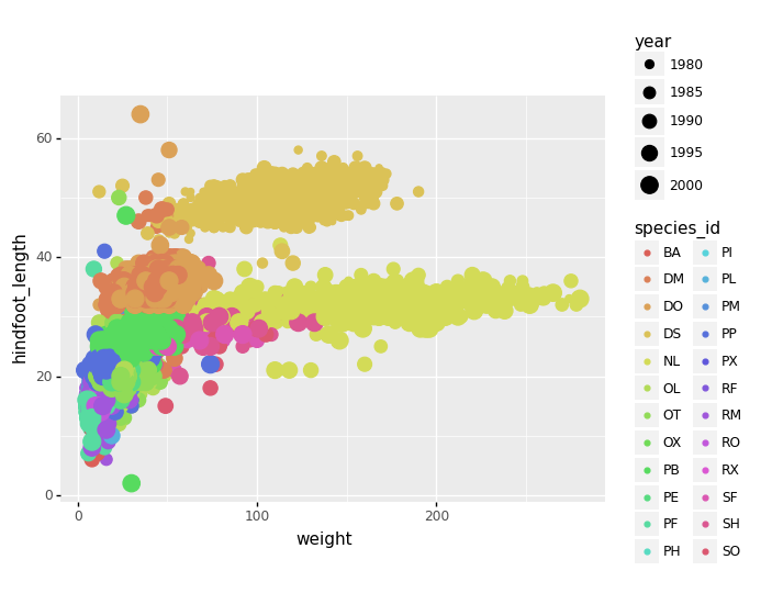
<ggplot: (8738737718399)>
We can do simple counting plot, to see how many observation (data points) we have for each year for example
ggplot(survs_df, aes(x='year')) + \
    geom_bar(stat = 'count')
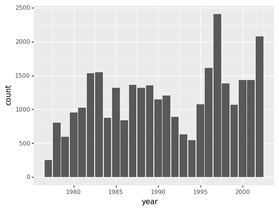
<ggplot: (8738736786240)>
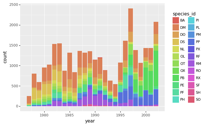
Let’s now also color by species to see how many observation we have per species in a given year
ggplot(survs_df, aes(x='year', fill = 'species_id')) + \
    geom_bar(stat = 'count')
<ggplot: (8738737076447)>
Challenges
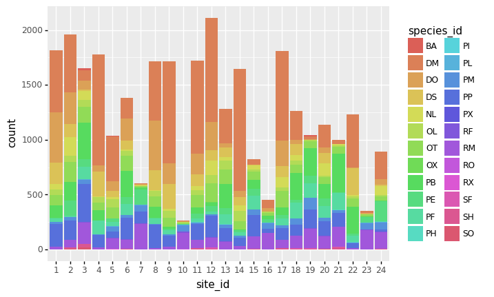
Produce a plot comparing the number of observations for each species at each site. The plot should have
site_idon the x axis, ideally as categorical data. (HINT: You can convert a column in a DataFramedfto the ‘category’ type using:df['some_col_name'] = df['some_col_name'].astype('category'))Create a boxplot of
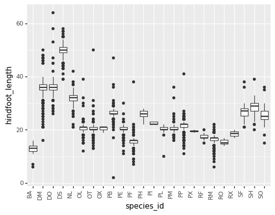
hindfoot_lengthacross different species (species_idcolumn) (HINT: There’s a list of geoms available forplotninein the docs - instead ofgeom_bar, which one should you use ?)
Solutions
# Part 1

# We convert site_id into a categorical column.
# This isn't strictly nessecary, but with categories we get all the x-axis labels
# (with continuous we don't by default) - try both and see
survs_df['site_id'] = survs_df['site_id'].astype('category')

ggplot(survs_df, aes(x='site_id', fill = 'species_id')) \
    + geom_bar(stat='count')
<ggplot: (8738736214203)>
# Part 2
ggplot(survs_df, aes(x='species_id', y='hindfoot_length')) + \
    geom_boxplot() + \
    theme(axis_text_x = element_text(angle=90, hjust=1))
<ggplot: (8738737726410)>
More geom types
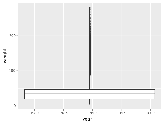
ggplot(survs_df, aes(x='year', y='weight')) + \
    geom_boxplot()
<ggplot: (8738735982698)>
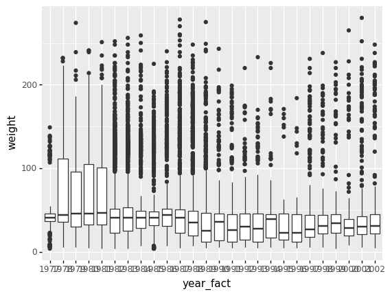
Why are we not seeing mulitple boxplots, one for each year? This is because year variable is continuous in our data frame, but for this purpose we want it to be categorical.
survs_df['year_fact'] = survs_df['year'].astype("category")

ggplot(survs_df, aes(x='year_fact', y='weight')) + \
    geom_boxplot()
<ggplot: (8738735961239)>
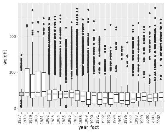
You’ll notice the x-axis labels are overlapped. To flip them 90-degrees we can apply a theme so they look less cluttered. We will revisit themes later.
ggplot(survs_df, aes(x='year_fact', y='weight')) + \
    geom_boxplot() + \
    theme(axis_text_x = element_text(angle=90, hjust=1))
<ggplot: (8738737470175)>
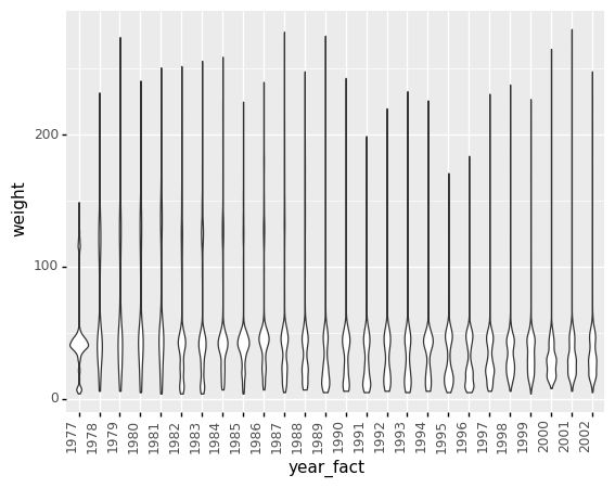
To save some typing, let’s define this x-axis label rotating theme as a short variable name that we can reuse:
flip_xlabels = theme(axis_text_x = element_text(angle=90, hjust=1))
ggplot(survs_df, aes(x='year_fact', y='weight')) + \
    geom_violin() + \
    flip_xlabels
<ggplot: (8738739891978)>
To save an image for later:
plt1 = ggplot(survs_df, aes(x='year_fact', y='weight')) + \
           geom_boxplot() + \
           xlab("Years") + \
           ylab("Weight log2(kg)") + \
           ggtitle("Boxplots, summary of species weight in each year")

ggsave(filename="plot1.png",
       plot=plt1,
       device='png',
       dpi=300,
       height=25,
       width=25)
Challenges
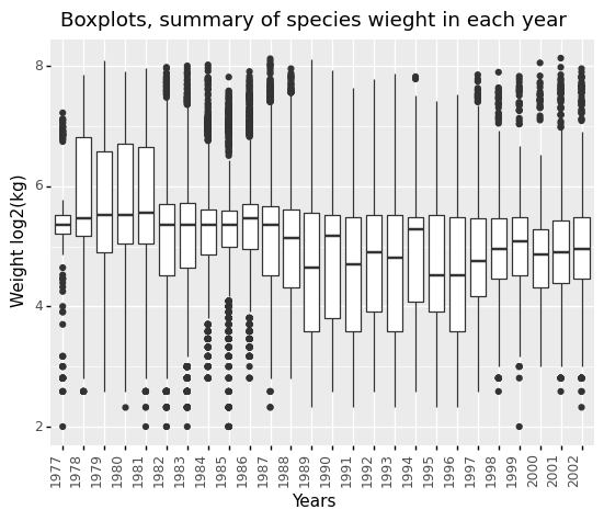
Can you log2 transform
weightand plot a “normalised” boxplot ? Hint: usenp.log2()function and name new columnweight_log.Does a log2 transform make this data visualisation better ?
Solution
survs_df['weight_log'] = np.log2(survs_df['weight'])

ggplot(survs_df, aes(x='year_fact', y='weight_log')) + \
    geom_boxplot() + \
    xlab("Years") + \
    ylab("Weight log2(kg)") + \
    ggtitle("Boxplots, summary of species wieght in each year") + \
    theme(axis_text_x = element_text(angle=90, hjust=1))
<ggplot: (8738737093666)>
Faceting
ggplot has a special technique called faceting that allows to split one plot into multiple plots based on a factor included in the dataset. We will use it to make one plot for a time series for each species.
ggplot(survs_df, aes(x='year_fact', y='weight')) + \
    geom_boxplot() + \
    facet_wrap(['sex']) + \
    flip_xlabels + \
    theme(axis_text_x = element_text(size=6))
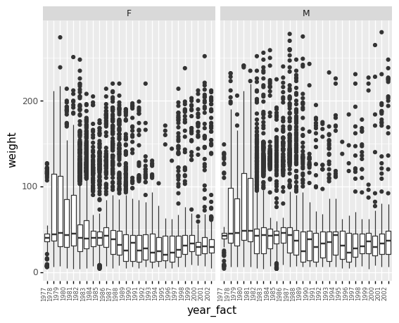
<ggplot: (8738737194481)>
ggplot(survs_df, aes(x='year_fact', y='weight')) + \
    geom_boxplot() + \
    theme(axis_text_x = element_text(size=4)) + \
    facet_wrap(['species_id']) + \
    flip_xlabels
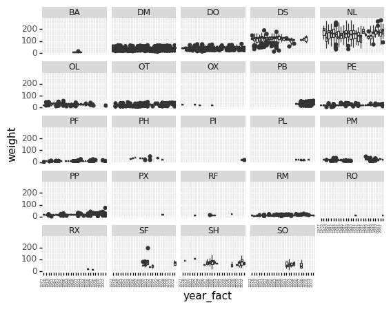
<ggplot: (8738730612020)>
The two faceted plots above are probably easier to interpret using the weight_log column we created - give it a try !
The “Layered Grammar of Graphics”
ggplot(data = <DATA>) +
  <GEOM_FUNCTION>(
     mapping = aes(<MAPPINGS>),
     stat = <STAT>,
     position = <POSITION>
  ) +
  <COORDINATE_FUNCTION> +
  <FACET_FUNCTION>
Theming
plotnine allows pre-defined ‘themes’ to be applied as aesthetics to the plot.
A list available theme you may want to experiment with is here: https://plotnine.readthedocs.io/en/stable/api.html#themes
ggplot(survs_df, aes(x='year_fact', y='weight')) + \
    geom_boxplot() + \
    theme_bw() + \
    flip_xlabels
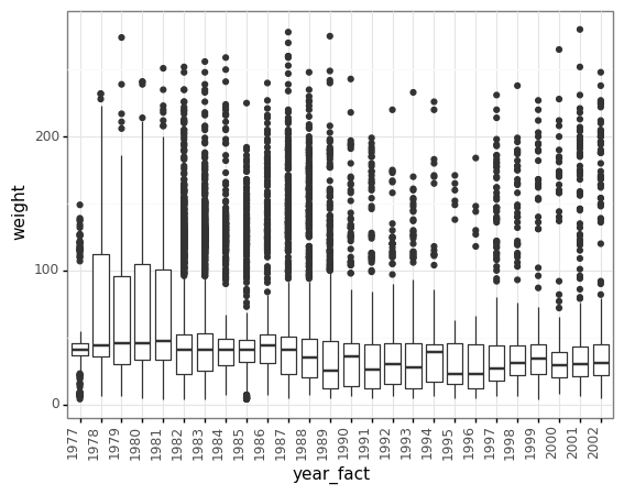
<ggplot: (8738737203743)>
ggplot(survs_df, aes(x='year_fact', y='weight_log')) + \
    geom_boxplot() + \
    facet_wrap(['species_id']) + \
    theme_xkcd() + \
    theme(axis_text_x = element_text(size=4, angle=90, hjust=1))
findfont: Font family ['xkcd', 'Humor Sans', 'Comic Sans MS'] not found. Falling back to DejaVu Sans.
findfont: Font family ['xkcd', 'Humor Sans', 'Comic Sans MS'] not found. Falling back to DejaVu Sans.
findfont: Font family ['xkcd', 'Humor Sans', 'Comic Sans MS'] not found. Falling back to DejaVu Sans.
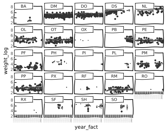
<ggplot: (8738729445108)>
Extra bits 1
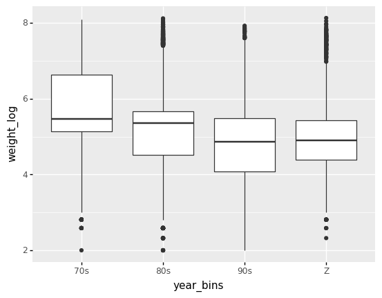
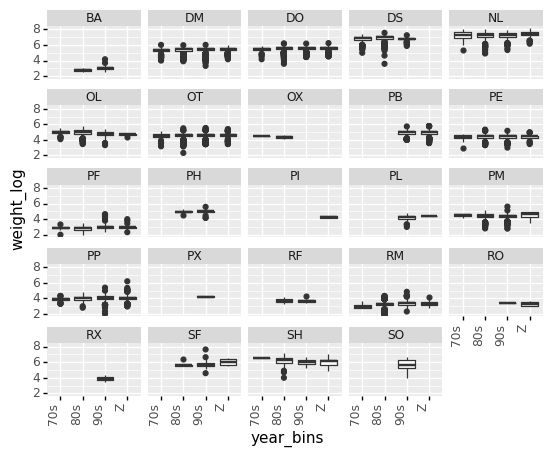
Let’s try to bin years into decades, which could be crude but might gives simple images to look at.
bins = [(survs_df['year'] < 1980),
        (survs_df['year'] < 1990),
        (survs_df['year'] < 2000),
        (survs_df['year'] >= 2000)]

labels = ['70s', '80s', '90s', 'Z']

survs_df['year_bins'] = np.select(bins, labels)
plt2 = ggplot(survs_df, aes(x='year_bins', y='weight_log')) + \
           geom_boxplot()
plt2
<ggplot: (8738736228124)>
plt2 = ggplot(survs_df, aes(x='year_bins', y='weight_log')) + \
           geom_boxplot() + \
           flip_xlabels + \
           facet_wrap(['species_id'])
plt2
<ggplot: (8738736164602)>
Extra bits 2
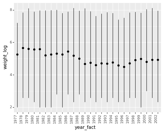
This is a different way to look at your data
ggplot(survs_df, aes("year_fact", "weight")) + \
    stat_summary(fun_y = np.mean, fun_ymin=np.min, fun_ymax=np.max) + \
    theme(axis_text_x = element_text(angle=90, hjust=1))

ggplot(survs_df, aes("year_fact", "weight")) + \
    stat_summary(fun_y = np.median, fun_ymin=np.min, fun_ymax=np.max) + \
    theme(axis_text_x = element_text(angle=90, hjust=1))

ggplot(survs_df, aes("year_fact", "weight_log")) + \
    stat_summary(fun_y = np.mean, fun_ymin=np.min, fun_ymax=np.max) + \
    theme(axis_text_x = element_text(angle=90, hjust=1))
<ggplot: (8738730558766)>
